Regular posts on all things around automated network & service management

Brand Focus
Successful rebranding in a tech based industry
How we transformed the leading automated network & service management solution StableNet® into a strong, autonomous brand
May 6th 2021, Würzburg
Have you ever asked yourself why you like some people more than others? Well, one reason could be that you share similar values with that person or that the person has traits you’d like to have for yourself. Personality, values and attributes are all elements that belong to our identity. The same principle applies to brands; if customers can identify with the brand’s values, they are more likely to like and trust that brand.
The main reason for the rebranding of StableNet® was the goal to visually express the brand identity with its characteristics and values and thus to position the brand in the best possible way. Only if the brand identity is consistently communicated to the outside world can brand trust and brand loyalty be built.
Rebranding offers a great opportunity to strengthen the company’s presence and image in the eyes of the customers. The areas which are rebuilt can vary, and the same is true for the reasons to change the branding in the first place. For StableNet® , one reason was a change in our strategy.
The story behind our rebranding
StableNet® is the leading platform for automated network and service management. It is also the focus product of Infosim® and is one of the main drivers of the company´s continuous growth. Especially in the Telco sector, we had cause to celebrate due success with new customers such as MTN and 1&1. With StableNet® , network operators can manage multi-vendor and -technology environments with one code base, one data source, one platform and one GUI. With that we have a unique selling point with our product.
StableNet® was able to solidify its identity and values with customers and partners over the years. However, its visual image was not an ideal representation of these values and the external communication didn’t do justice to the strength and success of the product brand. Furthermore, we changed our positioning and tagline from “Unified” to “Automated Network and Service Management” (see Automation Blogpost #1 for reasons). So it was just calling for a rebranding!
Defining the goals
Conscious branding can have a big influence on making the company appear more professional, modern and unique, and this was one of our goals. Another important point was to clearly distinguish the corporate and product brands from each other, to create clarity about their relationship. With regard to the brand architecture, we decided to pursue the strategy of “Endorsed Branding”, where the sub-brand is in the dominant position in communications and design, but still makes clear reference to the corporate brand. With this strategy, StableNet’s uniqueness can be communicated even better.
First of all, this meant that StableNet® needed to get its own distinct logo. But to be able to communicate a unified brand across all communication channels, a logo is not enough. A complete framework that expresses guidelines and design elements in the form of a style guide was needed. For this we worked together with a design agency.
As the logo was the key element of the rebranding, there were a few key requirements from our side. The most important point for us was that the logo visually communicates what StableNet® stands for and what StableNet® is all about. It was also very important that the reference to the corporate brand Infosim® was not lost, and there were some design components that we definitely wanted to keep, because they had already proven to be important assets, like our house font and some colors.
Visually representing the brand values
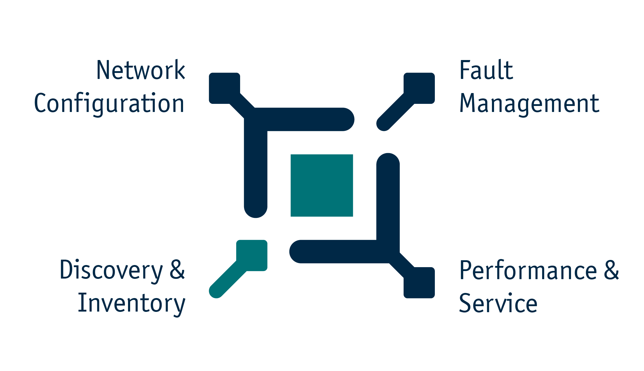
All elements of the new logo are consciously chosen to represent StableNet’s brand identity. The colors, appearance and shapes of the logo of StableNet® directly suggest the IT industry in which it operates. StableNet’s USP as an automated network & service management platform, including the four pillars of our 4-in-1 solution, is ideally embodied by the logo signet.

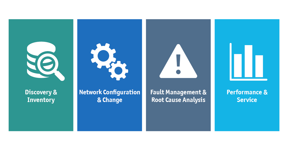
The four pillars of StableNet®

The outline or frame around the square can be interpreted as the all-in-one platform. The four pillars are represented by the small squares in the corners of the signet. Additionally, the turquoise part in the lower left corner symbolizes an arrow going upwards, which stands for data flowing in. The data is then processed and redistributed in StableNet® and flows out into different directions.
In a similar fashion, the values of stability, dynamism, flexibility, and positivity are also represented by various design elements in the logo. Additionally, the relatively wide font of the logo was chosen to harmonize with our existing Officina Sans font, which is rather narrow in contrast. The font in combination with the simple design of the signet make the brand look modern, professional and underline the high quality of StableNet® .
With this conscious rebranding of StableNet® , we were able to create real brand equity for our product that can continue to evolve and grow through consistent brand messaging for years to come.

Laura Zwaller
Brand Marketing Manager @ Infosim® GmbH & Co. KG
Laura is our branding specialist, taking care of everything related to the appearance of our brands. She is making sure that our brands are communicated consistently across all channels, with one of her biggest projects being the rebranding of StableNet® . Laura has a master’s degree in brand and media management. Before she started as Brand Marketing Manager, she already spent two years as a working student at Infosim® .

Software
Made in Germany
